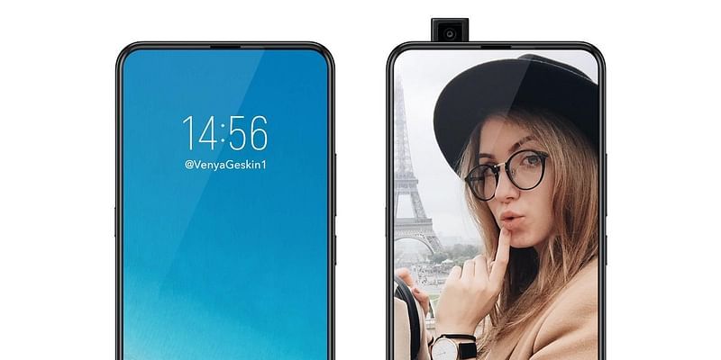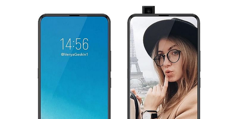
In the ever-evolving landscape of technology, a seismic shift might be on the horizon for Android users. Rumors are swirling that Google is gearing up to revolutionise smartphone displays by bidding adieu to the traditional status bar, making way for an immersive edge-to-edge screen experience. This bold move could potentially change how we interact with our devices, pushing the boundaries of UI/UX design further into the future. Let’s delve into what this could mean for Android enthusiasts and the smartphone industry at large.
A Seamless Transition to Immersion
The concept of an edge-to-edge screen isn’t entirely new, but Google’s rumored approach could take it to unprecedented levels. This design philosophy aims to provide users with a more immersive viewing experience, free from the distractions of bezels or status bars. Such a feature could be a game-changer for content consumption, gaming, and app interaction, offering a truly uninterrupted canvas.
Who Stands to Benefit?
This update is poised to be a boon for multimedia enthusiasts and gamers who crave expansive, unbroken displays for a more engaging experience. Additionally, professionals who use their phones for productivity apps might find the increased screen real estate a significant boost to their workflow efficiency.
Potential Shortcomings
However, every rose has its thorn. The removal of a dedicated status bar could pose usability challenges, particularly in accessing quick settings or viewing notifications at a glance. Google will need to innovate on how information traditionally housed in the status bar is integrated into this new design paradigm without cluttering the user experience.
Precedents in the Pursuit of Perfection
It’s worth noting that Google isn’t the first to flirt with the idea of edge-to-edge screens. Companies like Samsung and Apple have previously pushed the envelope with designs that minimise bezels and integrate the status bar in creative ways. However, Google’s approach seems to hint at a more radical departure from any visible interface elements, which could set a new standard for what users expect from their devices.
Envisioning the Future
So, what could an Android phone with an edge-to-edge screen look like? Imagine picking up your device and seeing your content, and only your content, with no physical or visual boundaries. The interface elements would appear as if floating on the display, dynamically adjusting based on the app or task at hand. It’s a step towards creating a more intuitive and natural interaction with our technology, blurring the lines between the digital and the physical realms.
While we await official word from Google, the prospect of an edge-to-edge screen Android phone sparks excitement and speculation. This update could redefine user engagement, setting a new benchmark for what is possible in smartphone design. As we stand on the brink of this potential UI/UX revolution, one thing is clear: the future of Android phones is looking boundlessly bright, and the status bar might just be the first casualty in the quest for screen perfection. Stay tuned, as we continue to monitor this exciting development in the world of technology.
Edited by Rahul Bansal


![Read more about the article [Funding alert] Edtech startup Braingroom raises Rs 1.5 Cr from IAN, Social Alpha, and Startup Oasis](https://blog.digitalsevaa.com/wp-content/uploads/2021/07/Imageetkx-1626673640042-300x150.jpg)


![Read more about the article [Funding alert] Locad raises $4.9M led by Sequoia Capital India’s Surge](https://blog.digitalsevaa.com/wp-content/uploads/2021/07/Imagedqk3-1625459884074-300x150.jpg)
![Read more about the article [Funding alert] Drone and AI tech startup Enercomp raises Rs 1.5 Cr in angel round](https://blog.digitalsevaa.com/wp-content/uploads/2021/09/Funding-Round-1631085424610-300x150.jpg)

