In this case study, we’ll show how we used research-driven CRO (conversion rate optimization) techniques to increase lead conversion rate by 79% for China Expat Health, a lead generation company.
Help TC find the best growth marketers for startups.
Provide a recommendation in this quick survey and we’ll share the results with everybody.

Image Credits: Jasper Kuria
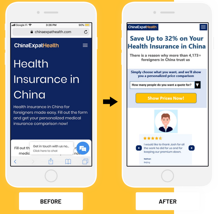
The mobile site view on the left labeled “before” is the control ( “A” version) while that on the right labeled “after” is the optimized page (“B” version). We conducted a split test aka A/B test, directing half of the traffic to each version, and the result attained 95% statistical significance. Below is a description of the key changes made.
Used a headline with a more compelling value proposition
The headline on the control version is “Health Insurance in China.” If I am an expat looking for health insurance in China, at least I know I am in the right place but I don’t immediately have a reason to choose you. I have to scroll and infer this from multiple elements.
For revenue-generating landing pages it is best to always follow the Bauhaus design aesthetic (from architecture). Form follows function, ornament is evil!
The winning version instantly conveys a compelling value proposition: “Save Up to 32% on Your Health Insurance in China,” accompanied by “evidentials” to support this claim — the number of past customers and a relevant testimonial with a 4.5 star rating (by the way, it is better to use a default static testimonial rather than a moving carousel).
As the famed old-school direct response marketer John Caples taught us, “The reader’s attention is yours only for a single instant. They will not spend their valuable time trying to figure out what you mean.” What was true in Caples’ 1920s heyday is doubly so in the mobile age, when attention spans are shorter than a fruit fly’s!


