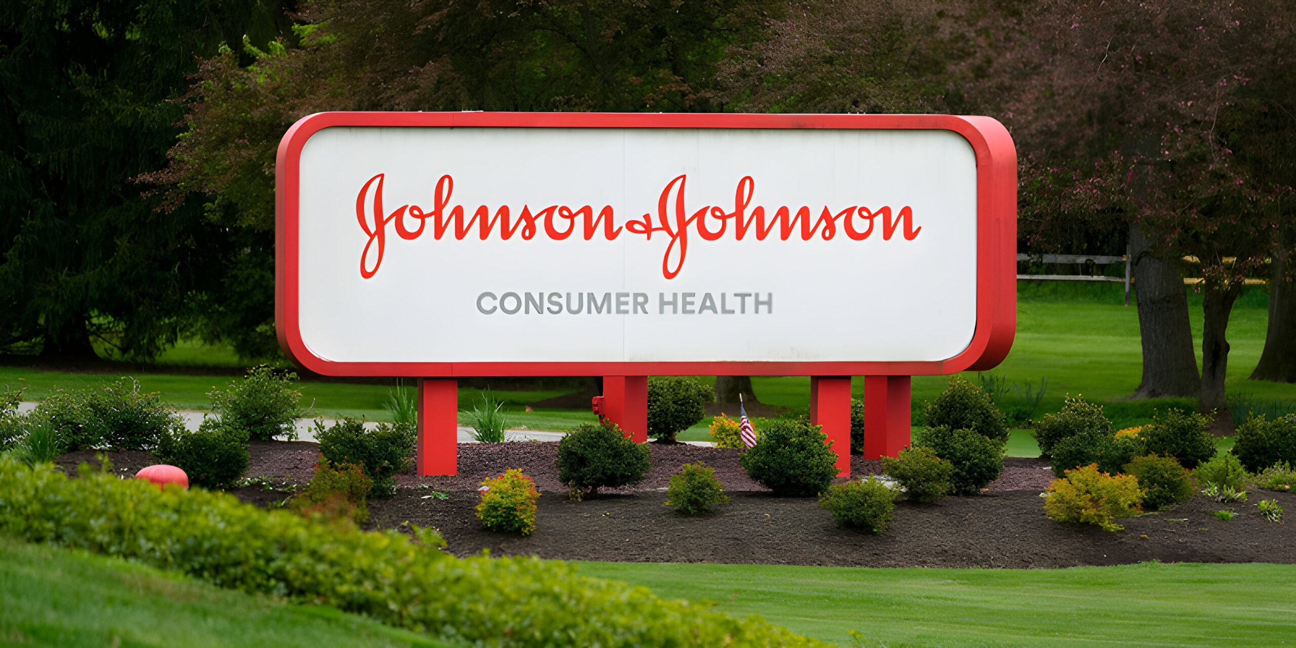
Johnson & Johnson, a major health care titan with roots in New Jersey, announced a significant transformation in its corporate identity. The company’s signature script logo, which dates back to 1887 and is based on the handwriting of co-founder James Wood Johnson, has been refreshed with a contemporary design. This iconic emblem, renowned for being among the world’s longest-standing company symbols, will now represent a more modern facet of the brand.
The rebranding emphasises Johnson & Johnson’s progressive direction towards cutting-edge medical technology and pharmaceuticals. As noted by the company’s CEO, Joaquin Duato, on LinkedIn, “To echo our commitment to pioneering medicine and advanced medical devices, we’ve opted for a fresher logo and a bolder shade of red, all the while retaining the iconic ampersand.”
This redefined look, enriched with a revamped hue of red, aligns with Johnson & Johnson’s evolution into a more specialised health care enterprise. Vanessa Broadhurst, an executive vice president at the company, commented to the AP about this shift, emphasising the firm’s intent to be perceived as a “pure play health care company.”
Further driving this point home, the organisation has rebranded its Janssen pharmaceutical unit to “Johnson & Johnson Innovative Medicine”. Similarly, its segment dedicated to medical devices and technologies will now be known as “Johnson & Johnson MedTech”.
The importance of a more modern and instantly recognisable logo in today’s digital age cannot be understated. Marketing expert Laura Ries highlighted a pertinent observation – the diminishing familiarity with cursive writing among younger generations. While many might have recognised the older script, it wasn’t necessarily comprehensible. “The revamped logo is not only more readable but also more engaging, instantly drawing one’s attention,” Ries mentioned.
Moreover, she speculated that for many consumers, the older script logo was possibly more associated with consumer-centric products such as Band-Aids, Listerine, and Tylenol, which they frequently encountered at drugstores.
As a testament to the shifting brand dynamics, a spokesperson for Kenvue, a spin-off entity from J&J, confirmed that the traditional J&J branding on popular items like Band-Aids will be phased out over time.
Historically, the script logo was synonymous with the company’s renowned baby powder, a product that has since been discontinued and was at the center of lawsuits concerning its safety. However, Johnson & Johnson has always maintained the product’s safety.
It’s worth acknowledging that J&J’s consumer division played a pivotal role in positioning it as the global leader in health care products. Yet, by the end of 2021, its pharmaceutical and medical device branches had grown substantially, overshadowing the consumer division in magnitude.
Johnson & Johnson’s logo transformation is not merely aesthetic. It’s a strategic move, mirroring the company’s focus on innovation and highlighting its dedication to the future of healthcare.
.thumbnailWrapper
width:6.62rem !important;
.alsoReadTitleImage
min-width: 81px !important;
min-height: 81px !important;
.alsoReadMainTitleText
font-size: 14px !important;
line-height: 20px !important;
.alsoReadHeadText
font-size: 24px !important;
line-height: 20px !important;