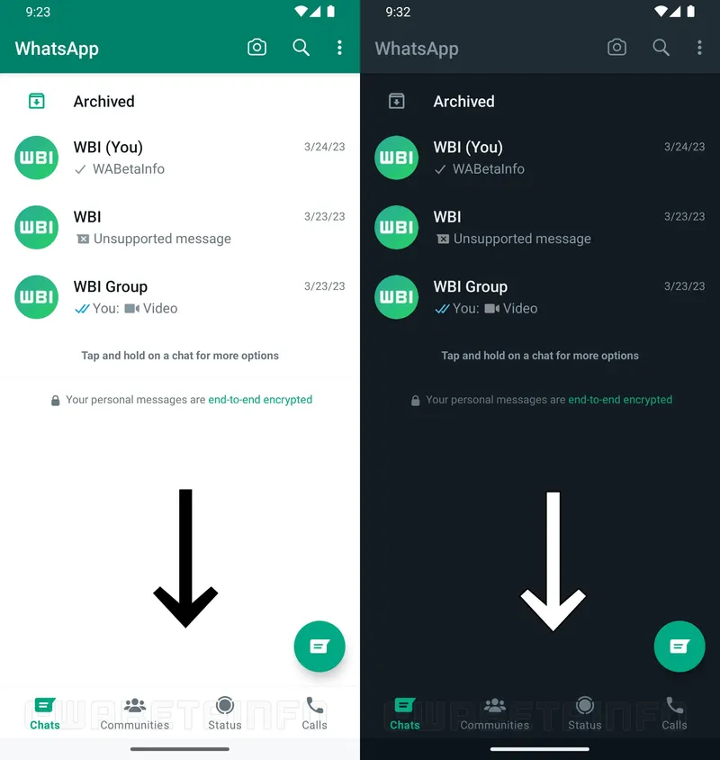
WhatsApp is currently developing an updated interface for its Android app, featuring a bottom navigation bar, to offer a more user-friendly experience. This redesign comes as a direct result of user feedback, who have been expressing their desire for an interface overhaul due to its outdated nature, particularly in light of recent Android updates. The bottom navigation bar will facilitate smoother transitions between various sections of the app such as chats, calls, communities, and status updates. This new navigation approach aligns with that of the iOS app, bringing about consistency across different platforms as mentioned by Wabetainfo.

For those who switch between iOS and Android devices, the existing differences in the WhatsApp interface have been a source of confusion. The development of the bottom navigation bar demonstrates WhatsApp’s commitment to addressing user feedback and enhancing the overall app experience.
The updated user interface, which incorporates the bottom navigation bar, is presently in development and will be launched in an upcoming app update.
The addition of the bottom navigation bar in WhatsApp for Android is a much-anticipated update for users seeking a more modern and intuitive navigation system. This improvement will not only provide easier access to key features but also enhance the overall user experience within the app.


![Read more about the article [Product Roadmap] How focus on technology helped Namaste Credit serve over 25,000 SMEs in 6 years](https://blog.digitalsevaa.com/wp-content/uploads/2022/01/GauravAnandNamasteCredit-1641904739862-300x150.jpeg)
